Lunds Konsthall
John Melin
, Unknown
Photolithograph
39 1/4 x 27 1/2" (99.7 x 69.8 cm)
Architecture & Design
39 1/4 x 27 1/2" (99.7 x 69.8 cm)
Architecture & Design
Two visitors, 160,000 artworks
Wren
The edges of the figures are fraying. A dark tide is swallowing the bottom of the paper.
Lumen
Does that dark ink wash have enough water in it to let the paper breathe, or is the saturation meant to weigh down the bottom of the composition? The way the graphite scratches across the surface creates a frantic rhythm that contrasts with the stillness of the larger, darker shapes. It feels as though the artist was trying to capture the energy of the movement before the ink could dry and fix the moment permanently. That heavy application of black at the base acts as a structural foundation, preventing the entire scene from simply drifting upward into the empty space. The struggle between the fluid washes and the sharp, precise pencil strokes creates a tension that keeps the eye from settling.
Wren
The white shapes are shards of bone. A thick, black smoke is choking the center of the frame.
Ritual stripped to its essential gesture: movement becomes object.
Lumen
How many layers of dye are hiding beneath that top layer of oil pastel? The way the rope pulls through the grommets creates a physical tension, dragging the fabric into shapes that wouldn't exist if it were just a flat canvas. That heavy application of oil pastel obscures the weave of the cloth, making the surface look dense and concentrated. It is hard to tell if the dye is meant to be a stain or if it is a structural part of the fabric itself. The choice to use rope as an assembly tool transforms the painting from a window into an object we could pick up.
Wren
Look at those yellow dots. They are a swarm of bees around the white holes.
Lumen
Could that be Naples Yellow or perhaps a more vibrant lemon pigment used to create those points of light? The artist used the oil pastel to build up a thick, granulated texture that surrounds the emptiness of the white circles. It looks as though the pigment was pressed into the fabric dye while it was still wet, allowing the color to bleed into the fibers. This technique makes the perimeter of those holes feel less like a boundary and more like a site of active growth. The way the rope threads through the grommets at the edges pulls the entire weight of the canvas downward, forcing the eye to focus on the density of the central marks.
Both transform the body into something that grows beyond itself.
Wren
The center is a hollowed-out eye. A bruise of green and purple spreads across the top edge.
Lumen
Is that ultramarine blue mixed with a touch of phthalocyanine to achieve such a deep, saturated tone? The pigment sits heavily on the paper, obscuring the underlying graphite lines where the artist sketched the initial anatomy. That heavy black mass at the bottom provides a weight that prevents the pink forms from drifting upward. You can see where the acrylic paint pools and thins, revealing the grain of the paper in some areas while remaining opaque in others. The pencil marks seem to struggle against the weight of the paint, acting as a skeletal structure that is being swallowed by the color.
Wren
The pink shapes are heavy, swollen fruit. Black drips run down the bottom like oil.
The body unravels differently each time, but the urgency stays.
Lumen
How did they manage to keep the pencil lines so sharp against that thick application of acrylic? The graphite marks seem to anchor the more fluid, fleshy shapes, providing a skeletal map underneath the pink and yellow washes. Those dark, sweeping strokes at the base look like they were dragged across the paper with a dry brush, leaving behind a broken, striated texture. This lack of smoothness creates a friction that makes the entire composition feel as though it is struggling to find its center. You can see the way the artist layered the pigments, building up density in the center of the forms and then scraping back at the edges to let the paper show through.
Wren
Look at those limbs. They are tangled wires. The white shape in the middle is a bone.
Lumen
Why would anyone choose to use such a stark, bone-like white against that aggressive, acidic yellow? The artist uses graphite to create a chaotic web of fine, nervous lines that seem to vibrate against the broader, more stagnant washes of acrylic. There is a tension between the smooth, translucent application of the pale tones and the jagged, heavy scribbles at the base. Those dark, knotted clusters of pencil marks act as weights, pulling the lighter, more fluid limbs downward. It feels as though the structure is being held together by nothing more than the friction of the lead against the paper.
The body strains against what won't give way.
Wren
A jagged white path cuts through the dark water. The steam from the engine is a grey shroud. The ice is a broken mirror.
Lumen
Does the silver in this print make the fog feel heavier to you? The way the gelatin process captures those mid-tones makes the industrial skyline in the distance seem to dissolve into the atmosphere. Notice the contrast between the dark, solid mass of the tug and the fractured, light-catching surfaces of the ice floes. The photographer must have waited for the exact moment when the light could penetrate that thick haze to define the edges of the broken ice. It turns a document of a frozen river into something much more structural and dense.
Wren
The chimney is a single black needle. A bird is a tiny ink blot in the sky. One of those white patches is a tooth.
Both catch the city mid-collision—ice and steam, argument and appetite—refusing to look away.
Lumen
How many people are actually involved in this mess? The gelatin silver print captures a frantic energy through those overlapping figures, caught mid-gesture in the middle of the street. The heavy shadows beneath the barrow's wheels create a solid anchor for the entire scene, even while the limbs of the crowd seem to be flailing in every direction. You can see the subtle tonal shifts in the highlights of the white shirts, which stand out against the darker, more chaotic silhouettes of the surrounding coats. The way the light hits the top of the wooden cart makes the structure feel much more substantial than the fleeting human movements around it.
Wren
Look at that white bucket. It hangs from a boy's hand by a thin wire. The shadows on the street are long, heavy planks of black.
Lumen
Was that bucket even meant to be part of the composition, or did the photographer just happen to catch it swinging? The weight of those shadows on the pavement comes from a high-contrast development, pushing the blacks into dense, opaque shapes that flatten the street. It makes the figures look less like people and more like cutouts placed against a backdrop of architecture. If you look closely at the boy's sleeve, you can see the fine grain of the gelatin silver emulsion struggling to hold the detail in such a dark area. The photographer chose a shutter speed slow enough to capture the motion, yet fast enough to prevent the entire scene from becoming a smudge of grey.
Wren
The man's hat is a black dome. A white line of smoke drifts from his mouth. That street corner is a deep, hollow pit.
Silver-gray becomes the color of longing — for what's lost, what's elsewhere, what's inside.
Lumen
Does the forest inside the tin actually belong there, or is it just a clever trick of the printing process? The offset lithography creates such a flat, even layer of color on the paper, making the edge of the metal lid look unnervingly sharp against the pine needles. You can see the way the cyan and magenta inks overlap to create those deep, shadowed greens in the trees. It’s a strange tension between the industrial, mass-produced look of the tin and the organic texture of the landscape. The designer used the graphic weight of the metal to trap the entire ecosystem inside a small, manufactured space.
Wren
The pink stamp is a fresh bruise on the metal. Sunlight pierces through the trees in jagged shards. The forest is a trap.
Lumen
Could that pink ink be a separate layer of printing, perhaps an added stamp applied after the main image was set? The way the magenta sits on top of the silver tones suggests a deliberate break in the visual logic. If you look at the way the light hits the rim, there is a subtle use of halftones to mimic the metallic sheen of aluminum. The artist manipulated the shadows to make the torn metal look heavy and jagged. It is a calculated use of negative space to force our eyes into that dense arrangement of vertical trunks.
Wren
Look at that silver rim. The jagged edge is a broken tooth. The pine trees are a wall of vertical bars.
Both sold a forest by selling restraint.
Lumen
Why does the blackness feel so dense, as if the ink could swallow us if we stepped too far into the frame? The artist used a heavy application of black lithographic ink to strip away any sense of horizon or distance. Only those thin, pale lines of light remain to suggest the presence of trees against the dark. It's a study in extreme contrast, relying on the starkest possible values to define a shape. There is no way to tell how far back the forest goes because the shadows lack any mid-tones.
Wren
The blue letters are ice. That white circle is a single, unblinking eye.
Lumen
Does the cyan ink in those letters feel colder than the rest of the composition? That specific shade of blue relies on a high concentration of pigment to pop against the charcoal blacks of the lithograph. The artist used a photolithographic process to ensure those edges remain sharp and clinical. It is a stark departure from the organic, streaked textures of the white forest floor below. There is a tension between that precise typography and the raw, uneven way the light seems to smear across the ground.
Wren
The bottom word is a small, hidden bird. The white shapes are slabs of salt.
Both trusted photolithography to turn geography into feeling.
Lumen
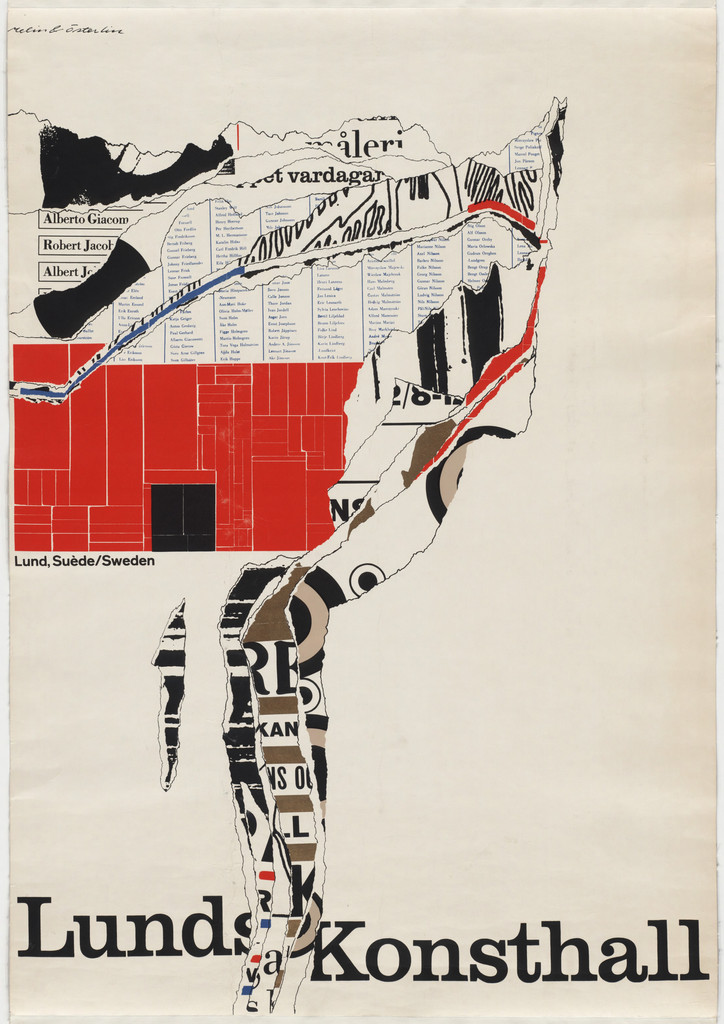
How many different layers of information are we trying to read at once? The artist utilized a photolithographic technique to layer those fragments, creating a sense of depth that makes the paper look thick with discarded scraps. That massive block of cadmium red anchors the upper left, providing a heavy visual weight that keeps the eye from drifting too far into the white space. The typography at the bottom is set in a bold, black sans-serif, functioning as a foundation for all that chaotic, torn texture above it. It looks as though someone took a finished, informative poster and physically ripped it into a new, abstract shape.
Wren
The black text at the bottom is a heavy anchor. Small, frantic names drift in the white space above. Is there a path through all these fragments?
Lumen
Could the path be found in the way the red shape cuts through the center? That block of vermilion acts as a bridge, forcing our gaze to jump from the heavy typography back up into the flurry of names. Notice how the artist used the tearing process itself to create a new kind of line, much more jagged than any hand-drawn stroke. The way the black ink bleeds into the white edges of the paper suggests a frantic energy, as if the information is still being assembled right before us. The arrangement relies on that tension between the solid, structural letters and the fragmented, disintegrating fragments above.
connecting...